A love letter to the brand that made the school-to-work transition look fun
Year13 is a not-for-profit helping young people live happier, more fulfilling lives by fixing the school-to-work transition. When I was a teenager, their brand had so much character and authenticity, and it stood bold in the sea of dull, institutional advice. It felt like young people helping other young people figure life out.
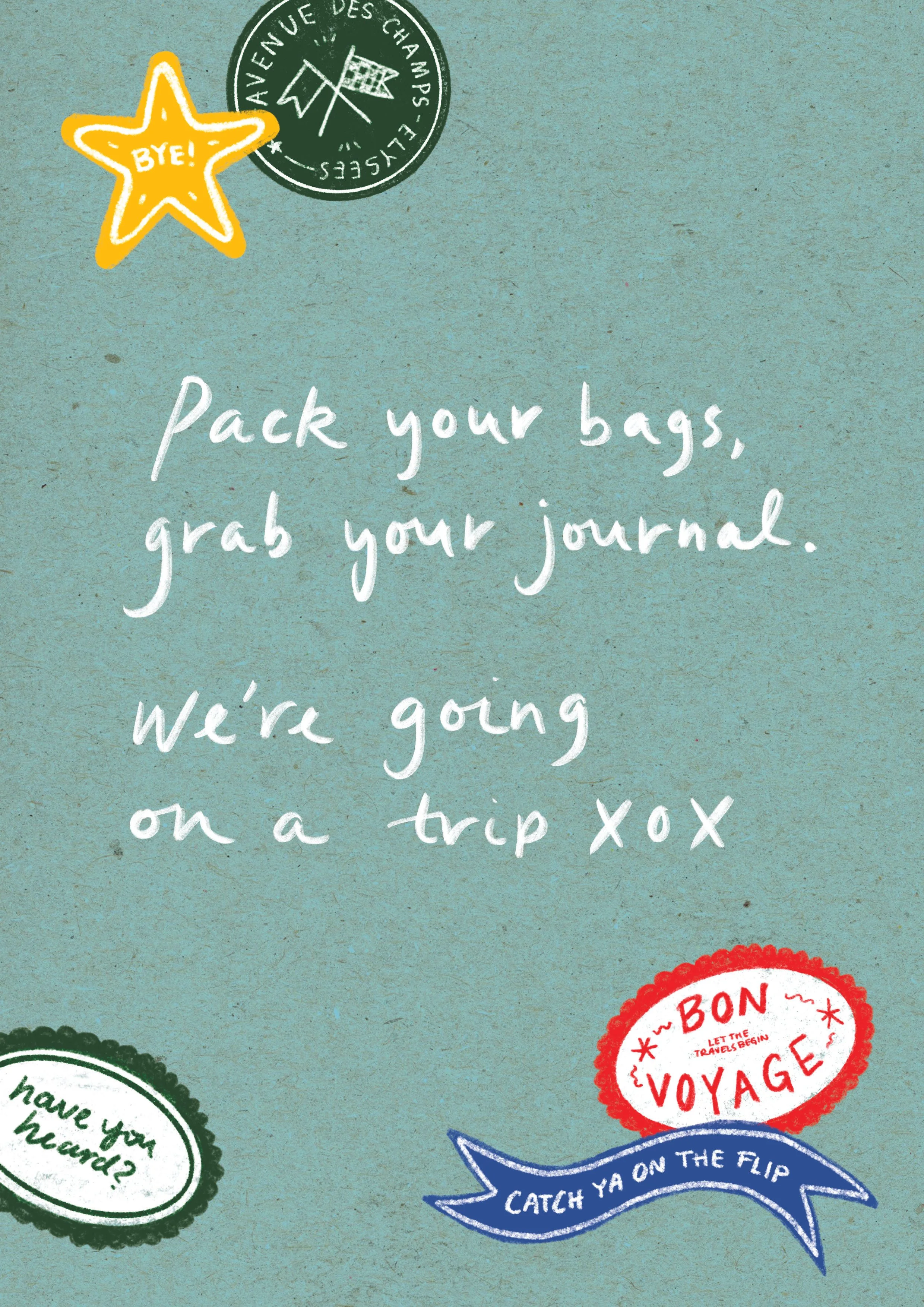
In 2022, Year13 rebranded, moving away from the lo-fi, photography-led aesthetic that made them so recognisable. This editorial piece is an ode to what that old brand stood for.

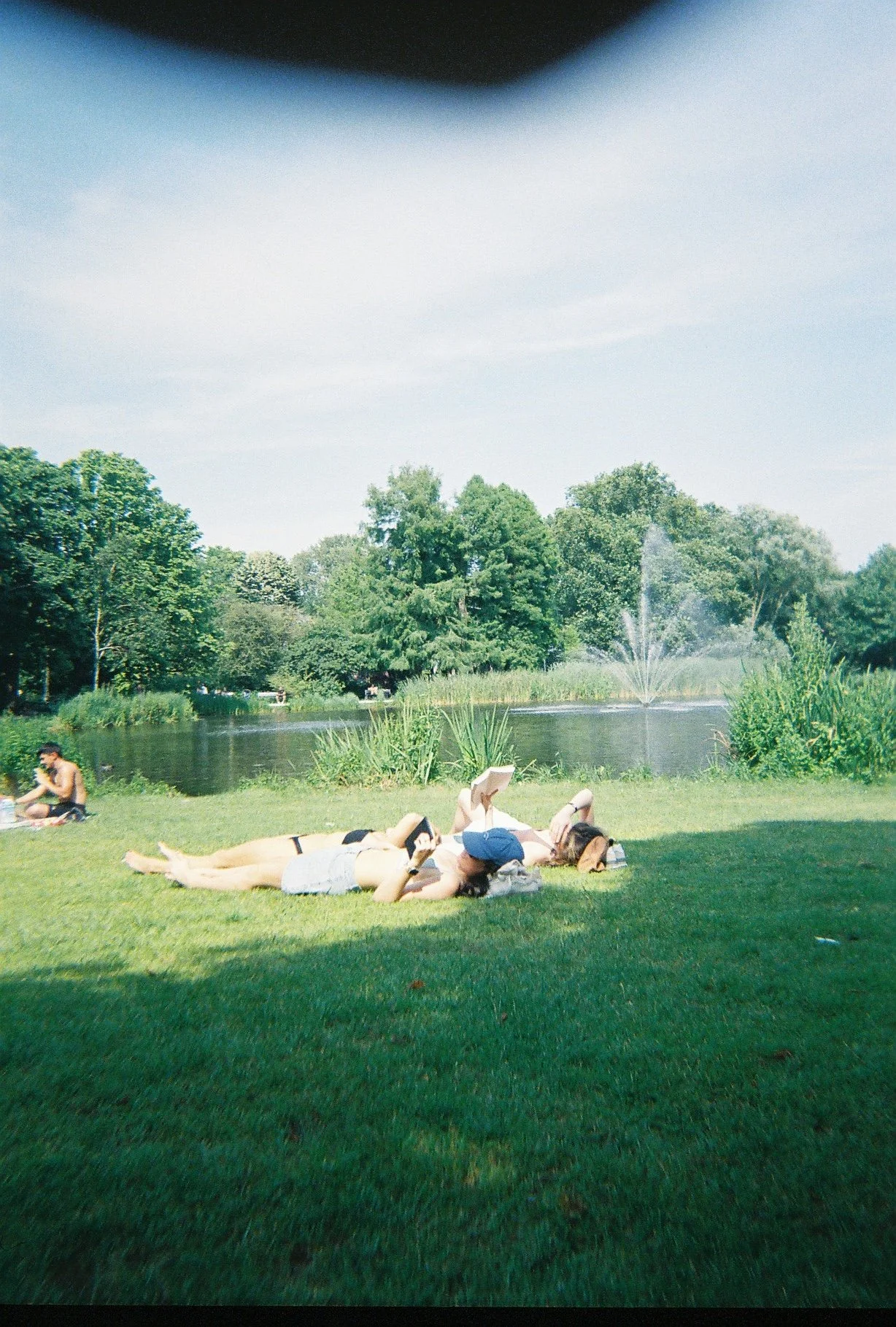
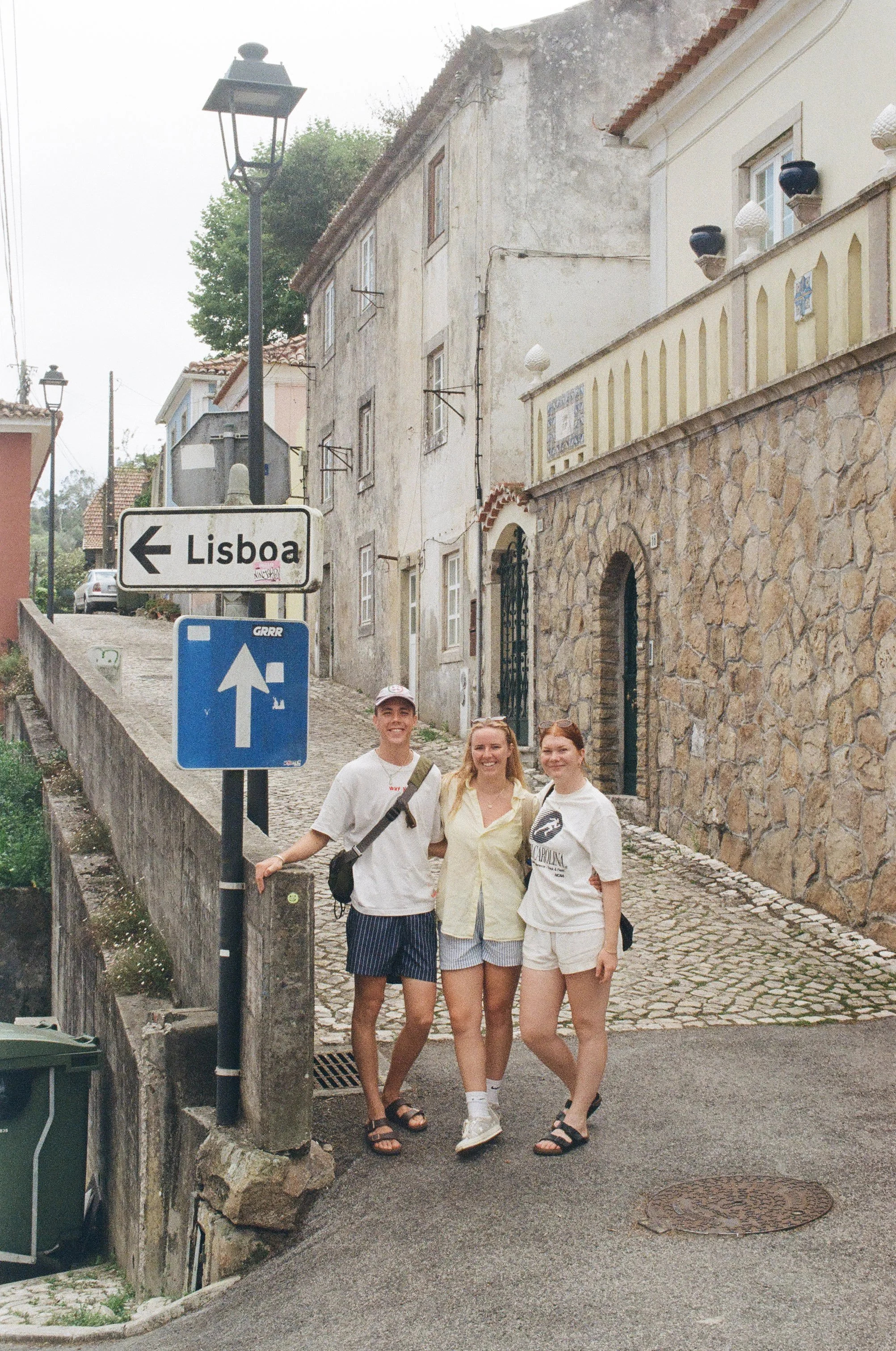
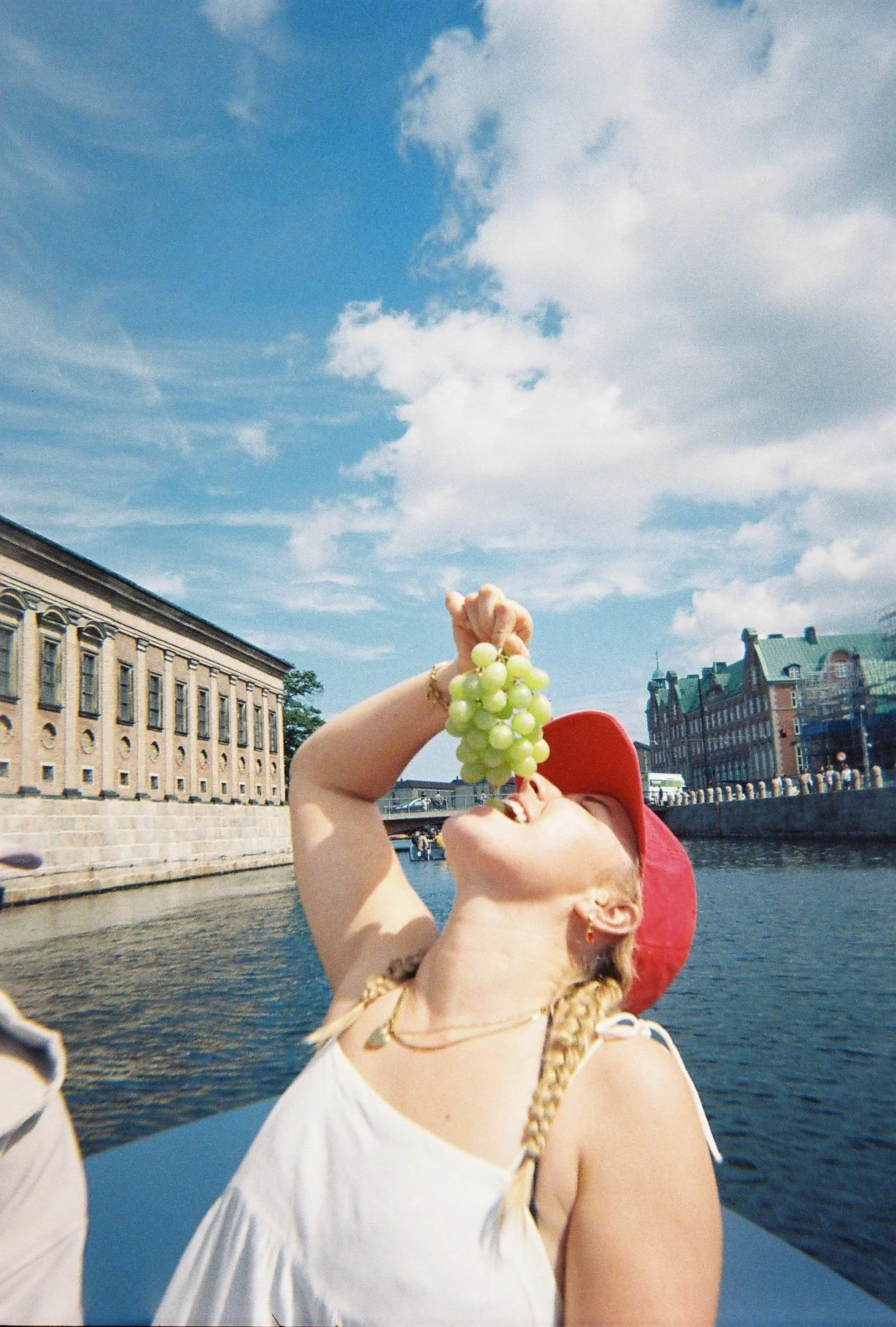
What I wanted to see at 17, printed and bound
I designed something I would’ve loved to flick through as a teenager. Something that’s less about polished paths, more about what it really looks like to discover things out in the big wide world.
This project is equal parts nostalgia and critique. It is a reminder of how powerful visual identity can be when it meets young people where they actually are.